The wild world of fonts can be a daunting one. There are a LOT currently in circulation and a large majority of fonts aren’t suitable for you or your business. So how can we cut through the noise and choose what's best for our brand? The answer is probably simpler than you might think, but it does require you to be conscious of what you want to convey, as different typefaces elicit a different feeling and meaning.
For example, imagine if Zillow decided to shift from its standard fonts to something far more inappropriate.
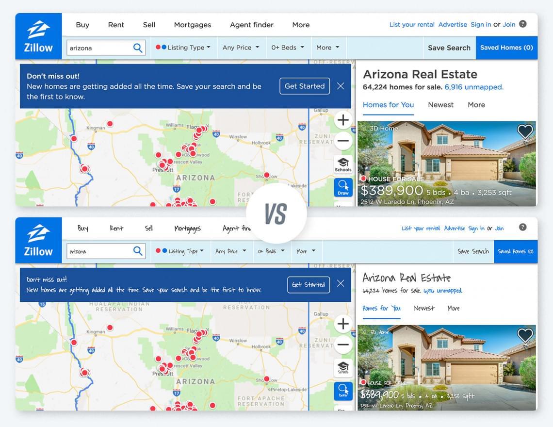
Would it have changed your first impression? Would you trust them?
When a potential client comes to you to sell or buy a home, they want to know that they're in the hands of a professional. How you choose to represent your business and your brand online can have a big impact on whether or not a potential client even gives you a chance to work with them.
So, what are typefaces?
Typefaces are more commonly known as font families, which to put it simply, is just a grouping of letters that share akin characteristics. They will have a similar weight, or grouping of weights, width, height, style, etc. You won't find that any letter from a typeface looks so wildly different from the the others in its family. There are, generally, two kinds of typefaces. Serif and Sans Serif.
Serif fonts have tiny decorative lines on the ends of a character. Times New Roman is a good example of a serif.
Sans Serif fonts simply don’t have additional embellishments on the ends of a character. Helvetica is a good example of a sans serif.
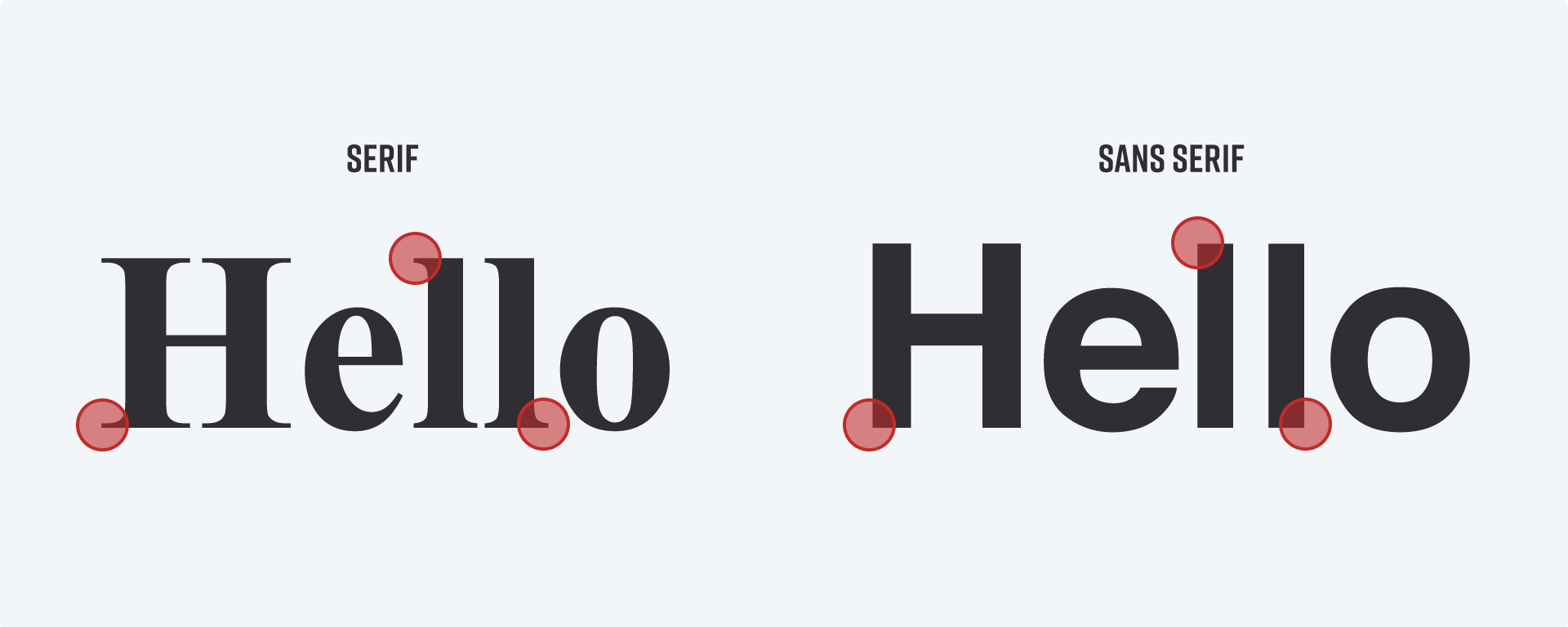
A simple rule of thumb is to pair a serif, and a sans serif together. The contrast between these two kinds of fonts often makes really beautiful pages almost by themselves.
We hand selected some beautiful font combinations from Google Fonts that can be used anywhere (including your curaytor website).
Fonts for Those Who Sell Luxury Homes
(or would like to)
When you look at luxury brands, there are a few typographic traits that really stand out. Sans serif fonts(often thin), simple high contrast color palettes, and tracked out letters. What often sells for these brands is forced minimalism in their design and a ton of white space to allow their content or products take the stage and do their talking for them. Here are some font combos that exude elegance without sacrificing readability.
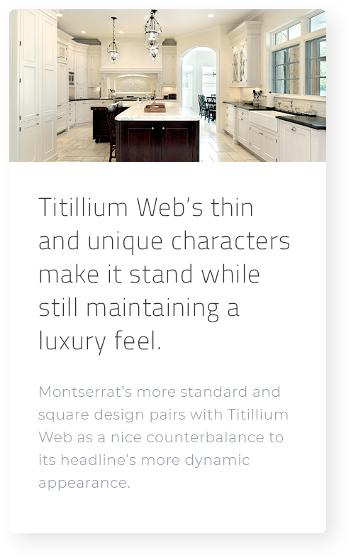
Titillium Web & Montserrat
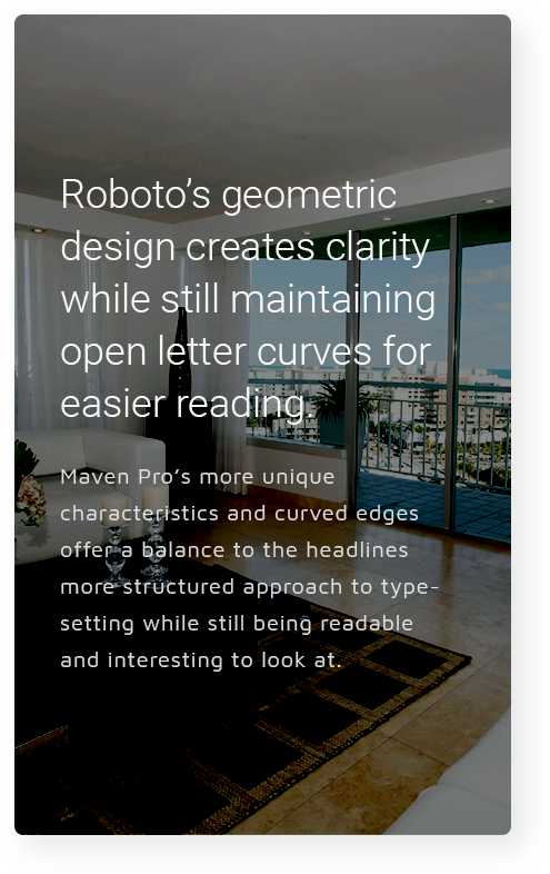
Roboto & Maven pro
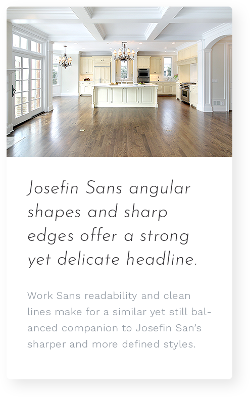
Josefin Sans & Work Sans
Fonts for Boutique Brokerages
Boutique brokerages often find that they have more leeway with how creative they can be with their marketing as well as their websites. Which allows us to be more expressive with some of the letterforms we can use (without going crazy). Here are some font combos that have character without overpowering the content.
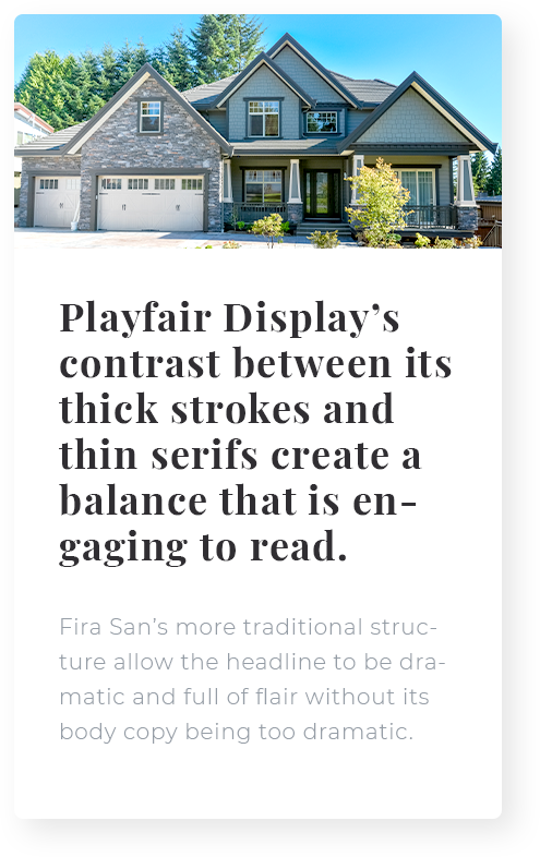
Playfair Display & Fira Sans
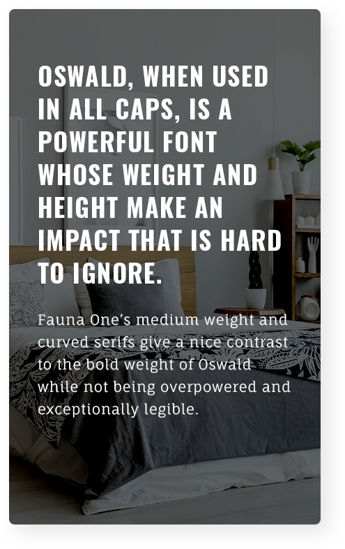
Oswald & Fauna One
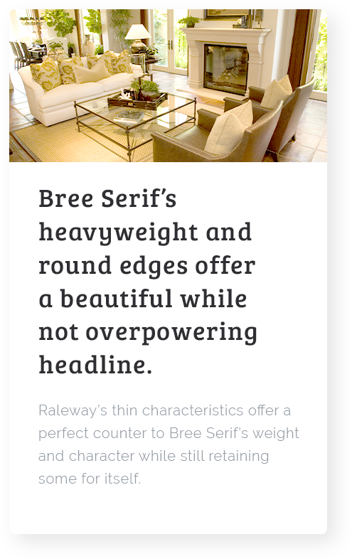
Fonts for the Real Estate Professional
Not every brand is quirky or whimsical, and not every agent deals with luxury homes. For the real estate professional who is just that (professional), here are some font combos that prioritize clarity - no matter your brand or market.
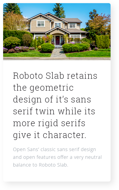
Roboto Slab & Open Sans
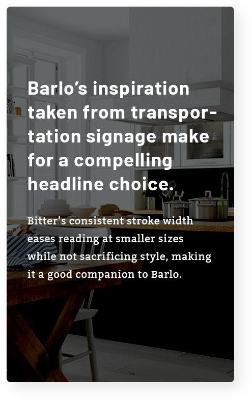
Barlo & Bitter
.png)
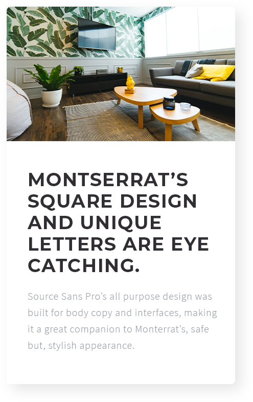
Montserrat & Source Sans Pro
Fonts for Those Who Like To Write
Some of us prefer our written words to really do our talking fo us, and if that applies to you, we can focus on pairs that can build beautiful experiences with just your powerful copy. Choosing Font Families that have more character to them and letters that are almost works of art themselves. Here are some font combos that any agent who loves to blog can use to maximize their writing efforts.
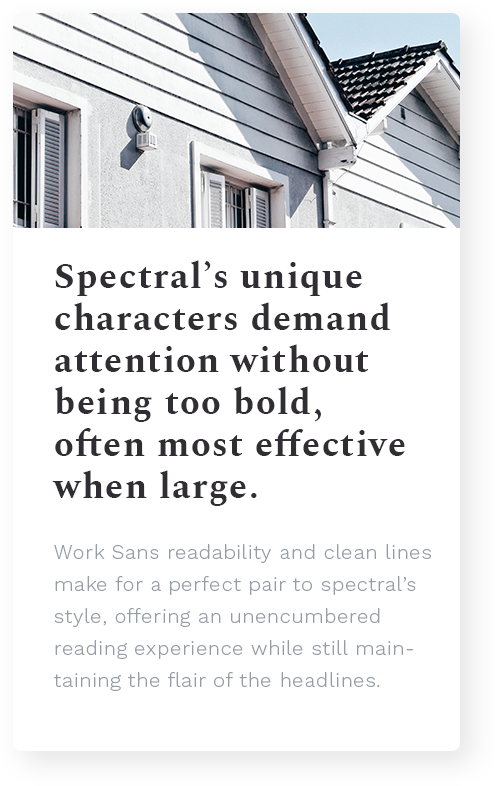
Spectral & Work Sans
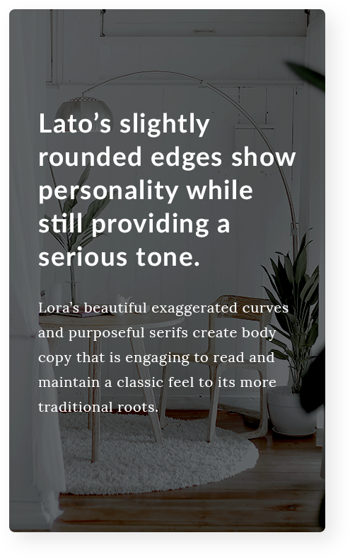
Lato & Lora
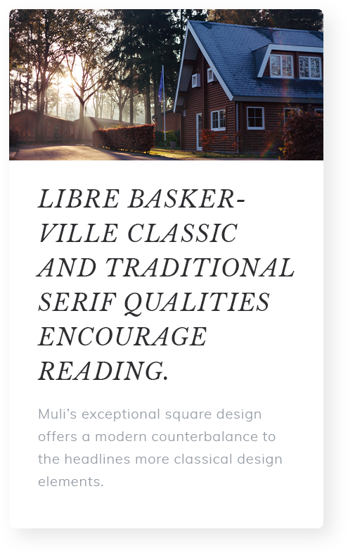
Libre Baskerville & Muli
